
| Adam Tiouririne | Bio | Posts 12 Dec 2014 | 1:23PM |
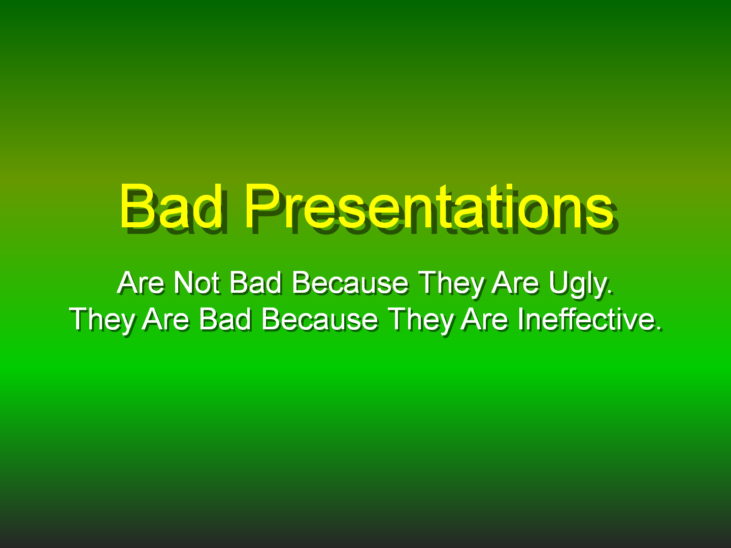
One of my favorite parts of my job (somewhere after obsessively watching the news) is designing the presentations that I and other Logos consultants use to coach CEOs and senior executives. One the most heartbreaking parts of my job is watching some leaders undermine brilliant content with visuals that are too complicated, too distracting, and too just-plain-ugly.
Just-plain-ugly visuals like this:

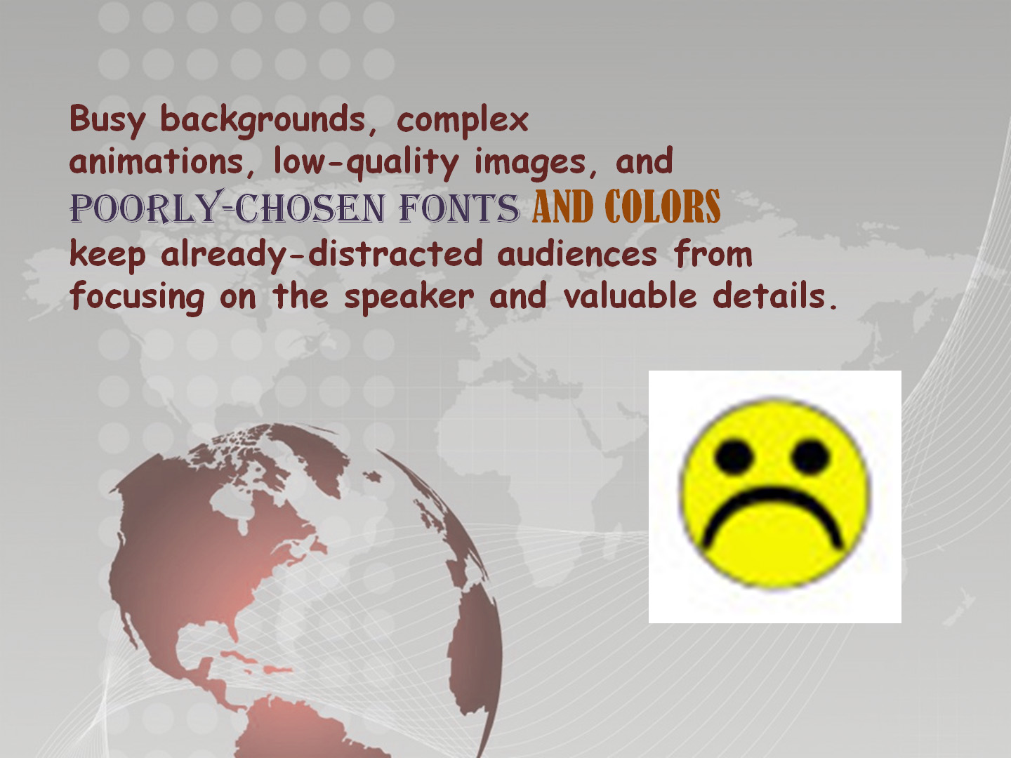
The words are mine, but the backgrounds are real-world slide templates. And the style (if you can call it that) is all too familiar.
Instead, get your Steve Jobs on with these three design principles — not for prettiness, not for sexiness, but for effectiveness.

Simplicity is about getting rid of the unimportant to focus on the important. Simple presentations help audiences – and sometimes even speakers – focus. Achieving simplicity is an act of ruthlessness: Doggedly delete every single thing that doesn’t directly support what your message.
This example shows how a few simple steps can transform a sales chart from distracting to impactful:

Thanks to the downtrend in useless junk, the audience can now focus on the uptrend in sales.

Consistency takes the guesswork out of presentation design and, more importantly, lets the audience focus on the content instead of visual flourishes. Achieving consistency is an act of discipline: Choose core visual elements before drafting a single slide, and then stick to them.
Here’s an example of how those core elements can work together:

Remember: Constraints make you more creative, not less.

Hierarchy is the visual manifestation of the elements of effective presentation structure, such as ordinal numbers, signaling, and repetition. Achieving hierarchy is an act of logic: Match each level of content with its own level of visual rendering.
These examples, from Logos presentations, prove that we’re taking our own advice:
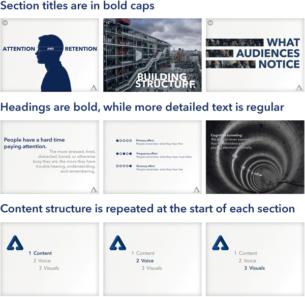
And at its best, hierarchy in design forces you to carefully consider the most effective structure for the content itself.
Simplicity, consistency, and hierarchy are the keys to creating slide presentations that support you, instead of overshadowing or undermining you. And achieving these principles takes a lot less time and effort than failing to achieve them.
Share your thoughts here, like this post on LinkedIn, or tweet @Tiouririne.